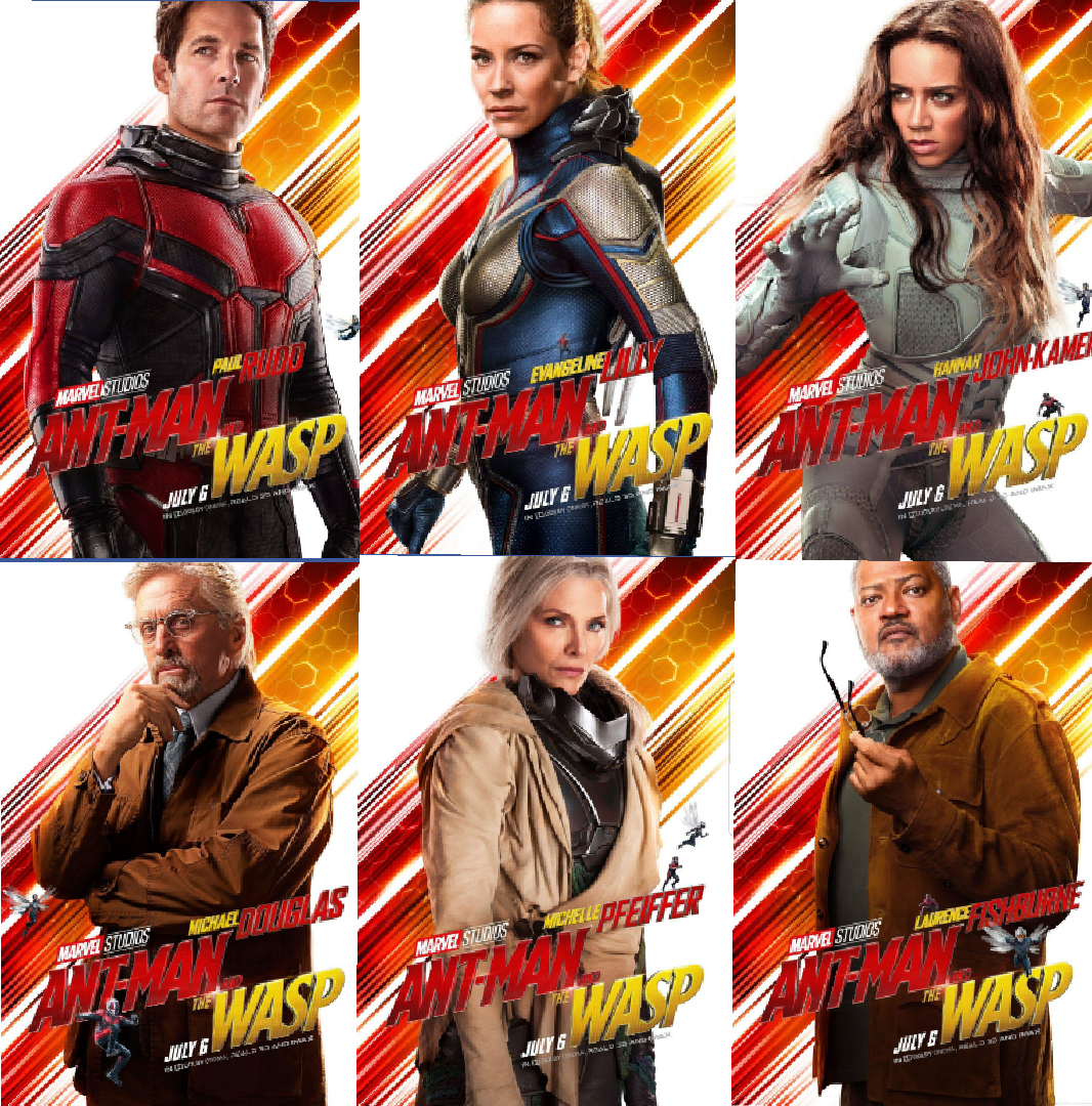
These character posters just got released for Marvel's upcoming Ant-Man & the Wasp, & I immediately noticed a couple things. The first was Wasp's costume. I may just be somewhat colorblind, but this is the first I've noticed her costume is blue. I even went back & rewatched the trailers. It reads way darker in those. Not that I care either way, just couldn't believe how much it popped on the poster. Two more of these posters caught my eye as well, with the rest basically just being standard. One was the inclusion of Lawrence Fishburne. I don't know if that's just because he's Lawrence Fishburne, or if it means that we'll be seeing more Goliath than I initially thought. I've loved Fishburne since he was Larry. So, giving him more screen time is a win for me. Always ready to add more heroes or villains to the Marvel universe as well. The second, & possibly main thing I noticed though, was how pissed off Michelle Pfeiffer looks. She's been trapped in the Quantum Realm for awhile. So I wouldn't expect her to he thrilled, but that's some determined anger on her face. That could mean nothing, but I'm all the sudden not the most trusting when it comes to this reunion. That's just me though. Anyone else have thoughts on these? Or thoughts on my insights? Put em in the comments, like, & share.
"Thor: Ragnarok" Puts Out 8 Character Posters
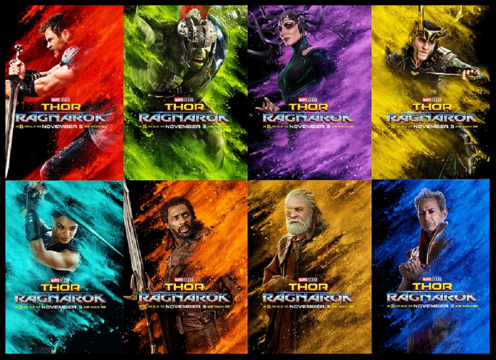
I just got told I could buy my early tickets for the Thor: Ragnarok "Fan Event" at AMC on November 2nd. At the same time Marvel was releasing these 8 character pics for the film. Yes, 8.... Basically every character that matters got their own poster. You've got Thor (Chris Hemsworth), Incredible Hulk (Mark Ruffalo), Hela (Cate Blanchett), Grandmaster (Jeff Goldblum), Valkyrie (Tessa Thompson), Heimdall (Idris Elba), Odin (Anthony Hopkins), & Loki (Tom Hiddleston). The posters are really cool for artsy posters. Using the many different colors of sand for each character just shows the diverse amount of color that will be in this film. As we've already seen in the previews. If I had to pick one that stands above the rest, I would probably go with the Hulk's. The obvious choice of color in his poster almost looks like he's teleporting "Nightcrawler" style. More so however, I really like how they looked when I put them all together. It almost looks like a Marvel pop-art piece. What do y'all think though? Are you feelin' these? What's your pick of the litter? Put it in the comments, like, & share.


